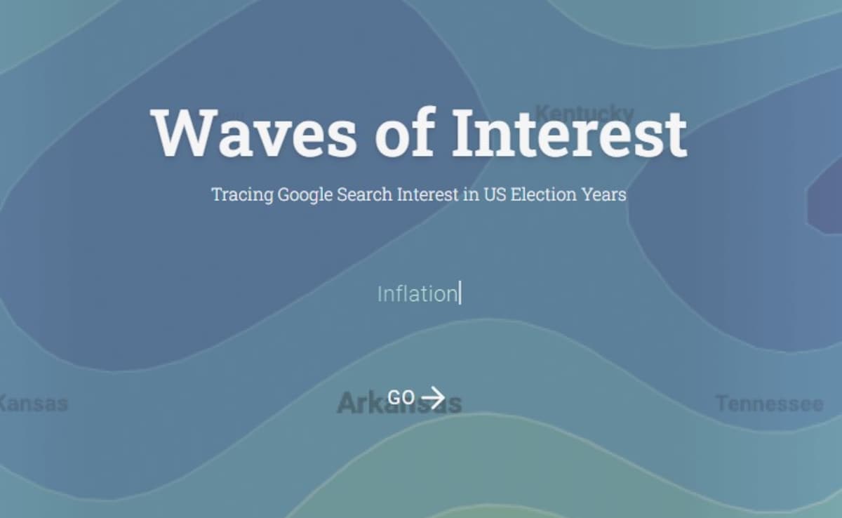
Inflation was the top trending topic during the US presidential election in 2024, compared to 2020, according to Google’s Waves of Interest — an interactive platform launched by the tech giant that traces search interest in the election years. Compared to 2020, the search for inflation was up 114 per cent, pension funds came in second with a 76 per cent increase while the budget deficit witnessed a 39 per cent surge. Racism, student loans, the Second Amendment, and gun control saw a decrease in search interest compared to 2020.
This 2024 edition is based on an earlier version launched on the occasion of the 2020 US election. During the previous election cycle where Donald Trump lost, electoral fraud was the biggest search term trend with a whopping 361 per cent increase compared to 2016 while ‘opinion poll’ saw an uptick of 342 per cent.
Also Read | Google Searches Skyrocket 1,514% After Donald Trump’s Historic Comeback
What is Waves of Interest?
Waves of Interest is a collaboration between Google Trends and Truth & Beauty that explores the hidden patterns in Google search data. This site presents Google Trends data on a curated set of political topics, comprising the currently most searched political concepts in the US, topics from Pew Research Center’s election surveys, as well as a few manual additions to account for emerging issues.
The platform shows both a list of top rising topics in the election years but also a detailed chart of how their search interest values unfolded over the years. Notably, the chart shows search interest for a particular topic in the years 2004-2024 by month.
“This comparison allows us to understand where we are in the “attention cycle” around certain topics – and also gives us an opportunity to introduce the topic lists we are working with,” said Moritz Stefaner of Truth & Beauty, who designed the platform.
On the detail page for a topic, the numbers on the map view show how search interest in individual states differs from the US average. The colour scale for the whole map is based on both the total search volume for the topic in that year.


